Mobile app / UX copy
“We need an online quote that’s mobile-first and intuitive so people don’t call to follow up, — and gets people to opt in to sharing their location data.”
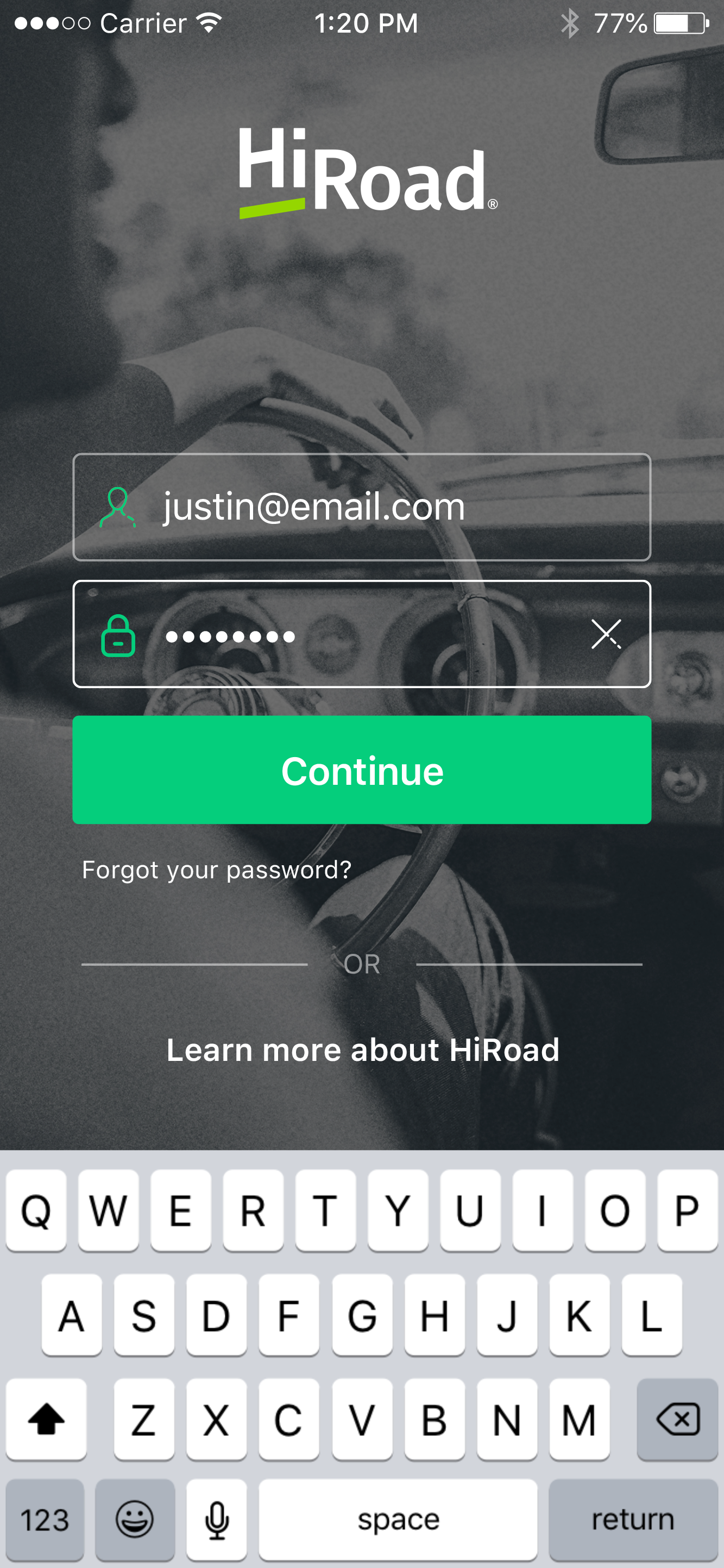
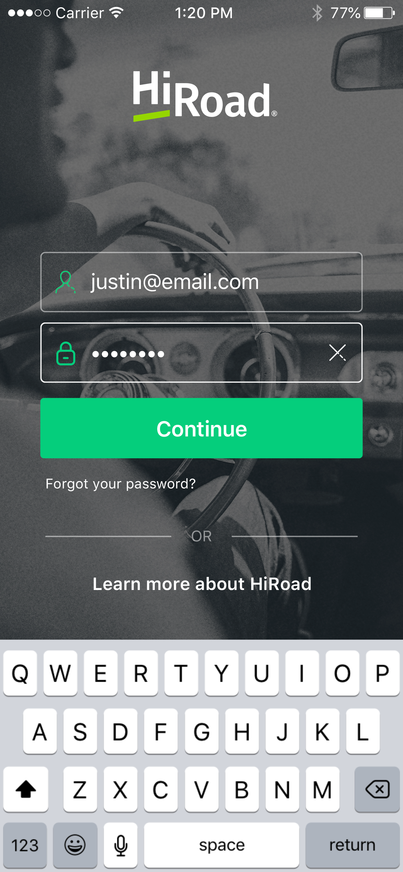
Does this look like your parents’ stuffy, red and blue insurance app? No it does not.
The HiRoad app had its work cut out for it: insurance is a low-interest, low-interaction, transactional category. Meanwhile, we were trying to introduce a new, behavior-based model, where customers would be billed based no just on traditional ZIP code or demographic data, but on how they drove. We also wanted to shift how they thought of insurance: not as adulting chore, but as a values-based lifestyle brand.
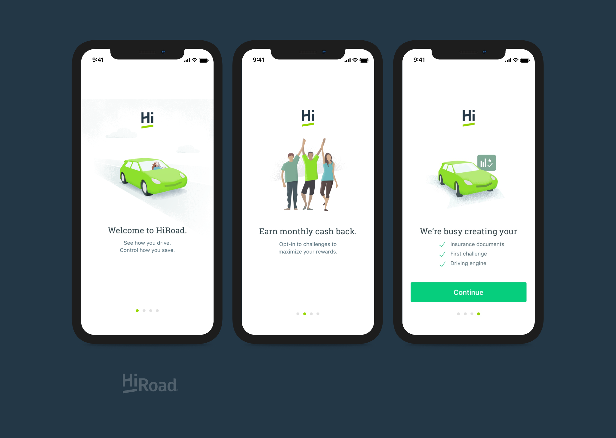
Onboarding screens with illustrations
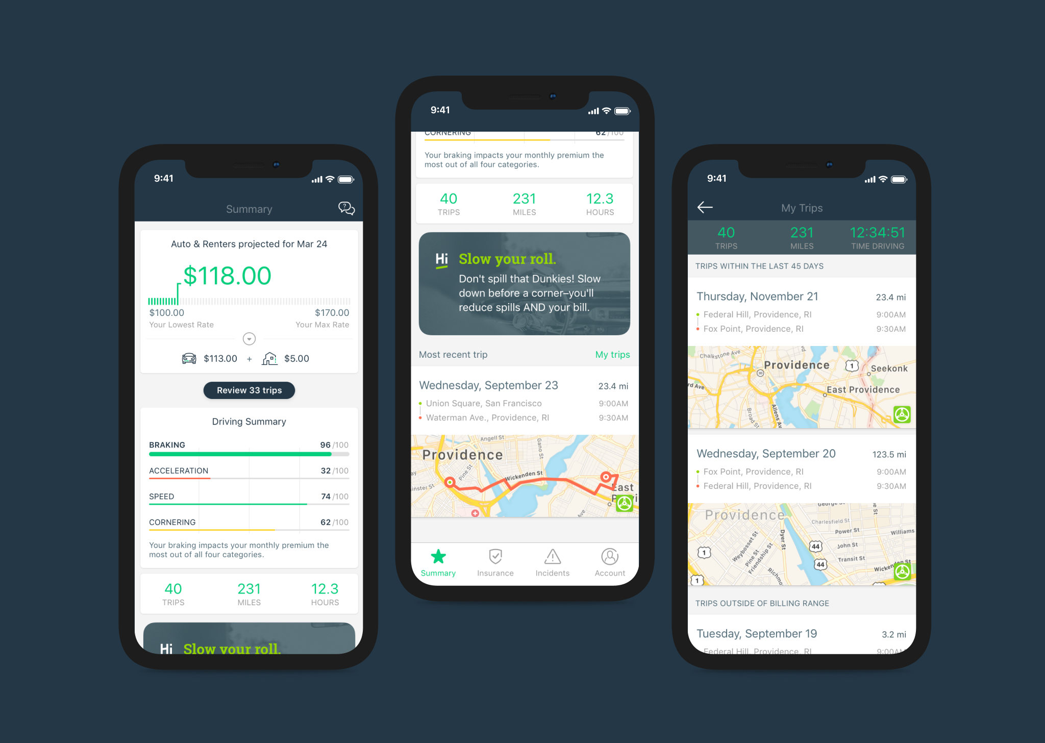
Bill summary, driving scores, and trip log
Our UX copy had the unique challenge of balancing accurate information about serious topics, with being conversational and engaging to stand out from the category. (Since we were launching in Rhode Island, I was pleased to work in a reference to New England’s most famous coffee chain in the “Slow your roll” driving tip.)
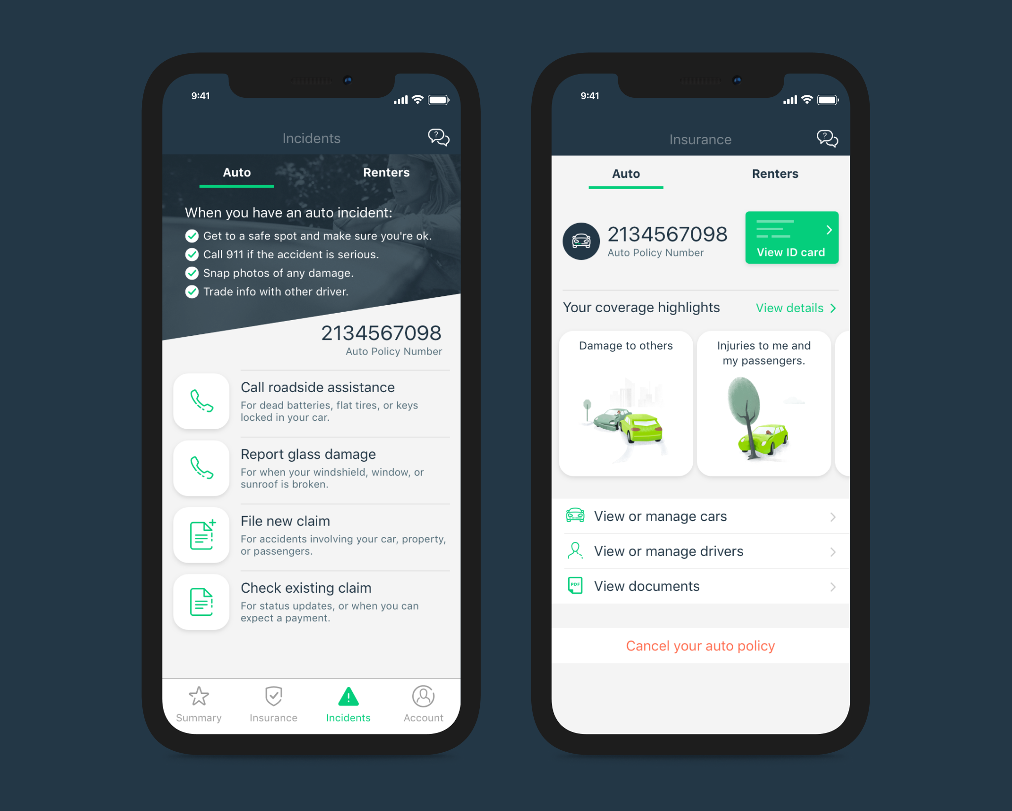
Incidents & coverage tab
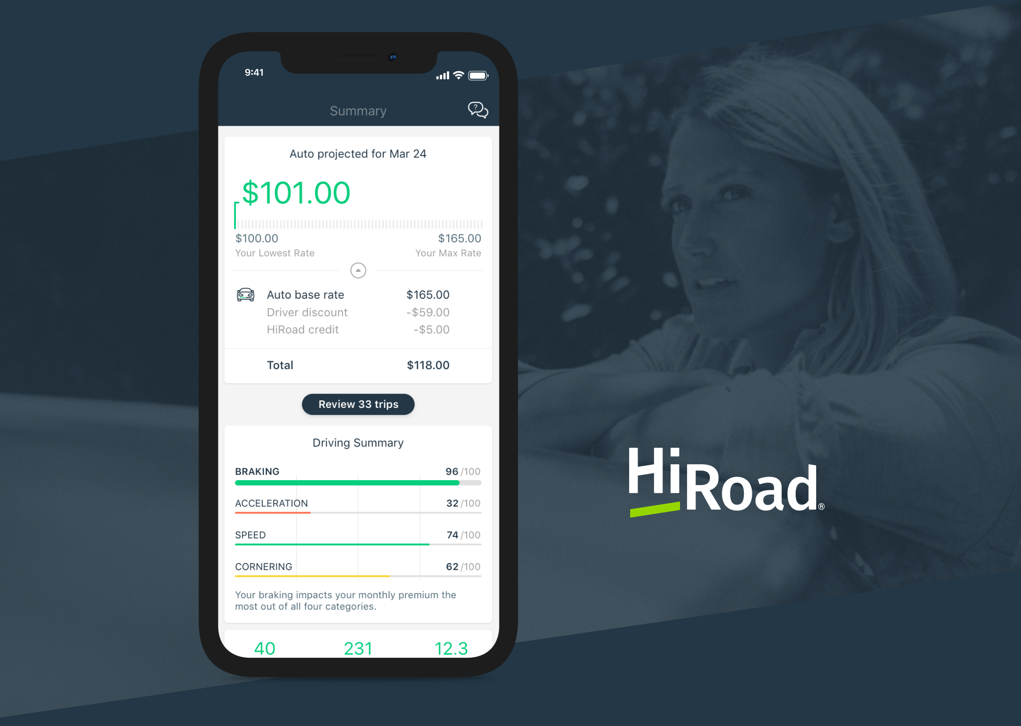
Summary & projected bill